E-commerce
lifestyle
Mobile app
Gift Cards
A new digital gifting experience inside the My O! SuperApp
My role
End-to-end design (research, user scenarios, design, documentation, testing)
Team
UX/UI designer (me), product manager, UX writer, iOS/Android/Web developers (contactors)
Product
Gift cards platform inside My O! SuperApp
Problem
While My O! offered essential financial and telecom services, it lacked lifestyle-driven features that could increase user engagement and transactional frequency.
At the same time, users had no simple way to discover and send digital gift cards across different brands within a single, trusted platform.
Goal
Success metrics
Although designers in the company were not directly included in metric ownership, from a product perspective I would define the following key metrics to assess impact:
Number of gift cards sold
Number of onboarded partner brands
New user acquisition
Engagement rate
Challenges & constraints
My first major end-to-end service design at DevCats, and the first mobile app service I led independently
The solution had no precedent in the Kyrgyzstan market, creating uncertainty about user expectations and competitive standards
We also faced significant technical constraints, including tight deadlines and developer capacity, which led us to pivot from native implementations to a WebView solution. This decision required simplifying interactions, prioritizing critical flows, and ensuring consistency within platform limitations
Research
Since no similar local solution existed, I conducted a structured competitor analysis of international digital gifting platforms to identify best practices in marketplace structure, redemption logic, and discovery flows.
With the help of QA I also got user's insights to better understand gifting behavior and expectations in the local market.
Key insights and design decisions:
SPEED IS CRITICAL
Users want to purchase gifts quickly, often in time-sensitive situations
The process should require minimal steps and no complex decision-making
LACK OF AGGREGATION
There is no platform where users can browse gift options across multiple brands in one place
Design a centralized marketplace model instead of single-brand entry points
REMOTE GIFTING MATTERS
Many users need the ability to send gifts digitally, especially when they cannot meet in person
Online purchase with convenient gifting process
CLARITY REDUCES HESITATION
Users are more likely to purchase when conditions and value options are clearly explained upfront
Onboarding would help

JTBD and hypotheses
Based on these insights, I applied the JTBD framework to shape product hypotheses and inform key design decisions.
When I don’t know what to buy, I want to browse inspiration, so I can make a quick decision without overthinking
Categorized marketplace with filtering and curated suggestions
When I buy a gift card, I want to choose the amount that fits my budget, so that I stay in control of my spending
Flexible denomination selection with clear price visibility
When I send a gift, I don’t want to ask the recipient for too much information, so that the process feels natural and effortless
Send by phone number only, no complex recipient forms
Clear delivery confirmation, redemption instructions, reminders
Product architecture
I divided the entire product into 2 major parts:
gift cards' showcase
admin panel for content managers (although not visually designed by me, I defined requirements)
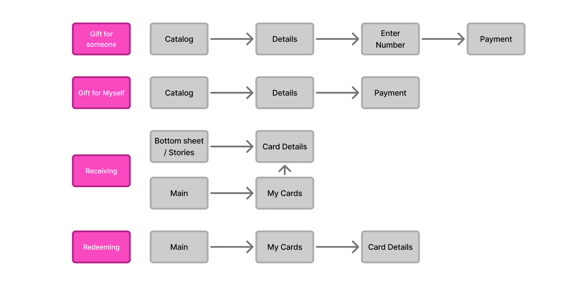
User scenarios
There were 4 main scenarios:
buying and sending it as a present to someone
buying a gift card for myself
receiving a gift card (for the app user and for the non-app user)
redeeming at partner's point
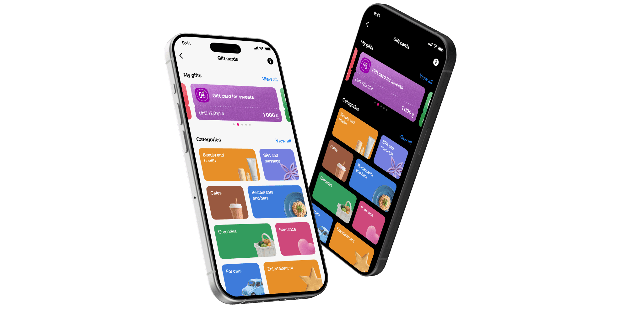
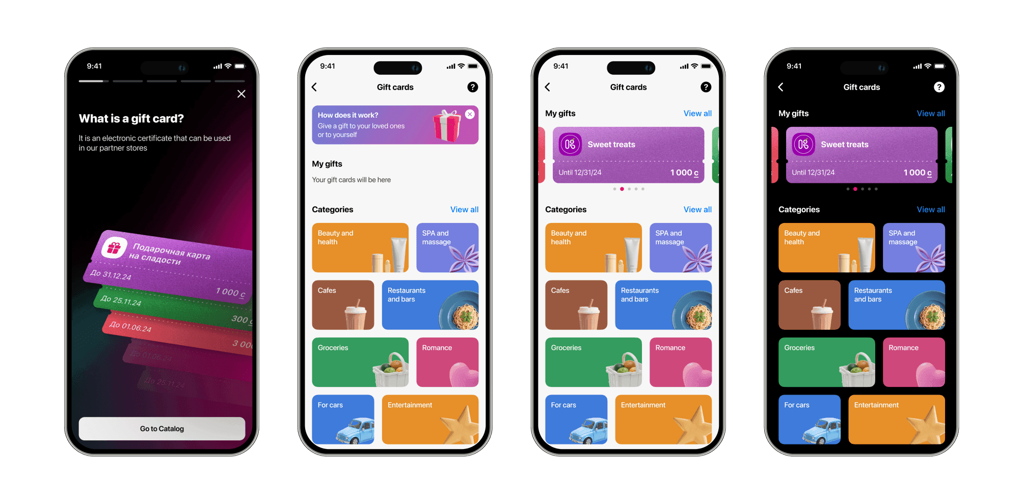
Onboarding and main screen
According to the research it was crucial to emphasize clear instructions upfront, so I added an onboarding as a start.
To reinforce gifting as an emotional act rather than a transactional one, I introduced vibrant visual treatments and AI-generated catalog illustrations. This enhanced perceived value and helped differentiate the feature from purely financial flows within the SuperApp.
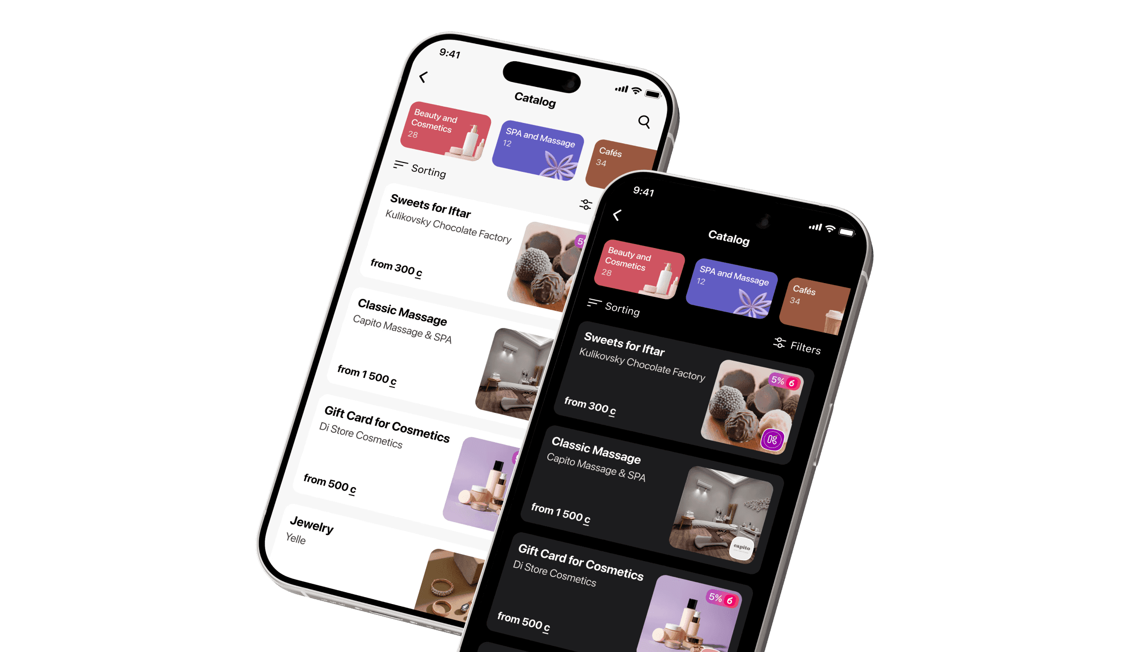
Marketplace Structure
I prioritized use-case-driven discovery through:
Categorization
Filtering
Search functionality
Visual differentiation
This approach improved findability, particularly for users who start with a gifting intention rather than a specific brand in mind.

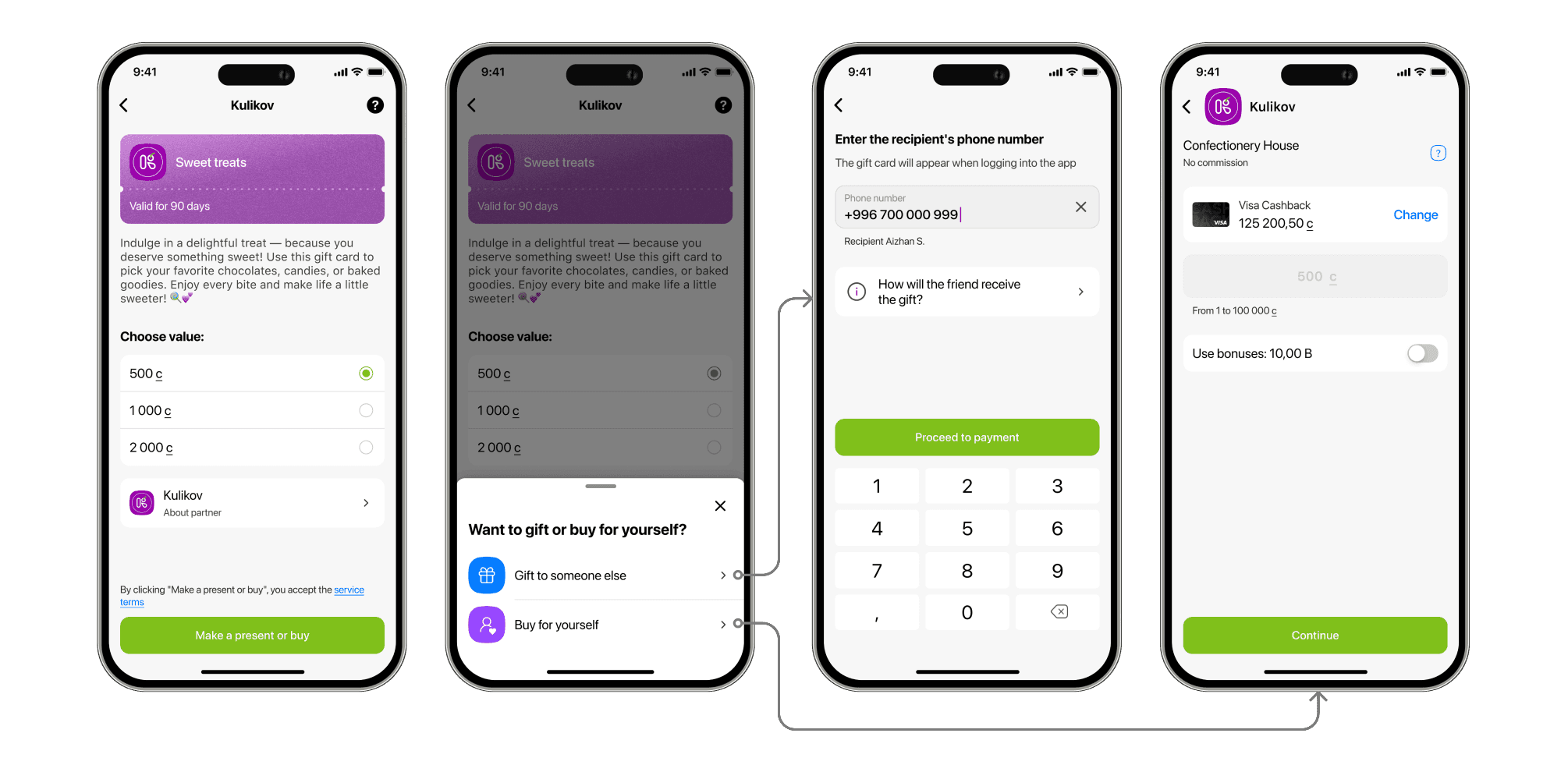
Buying & Sending a gift card
Since the research insights highlighted speed as critical, I:
Minimized the number of purchase steps
Reduced unnecessary confirmations
In this flow a user selects a gift card, chooses the value, enters recipient details, and completes the purchase. The user also can purchase a gift card for themselves and store it inside the app.
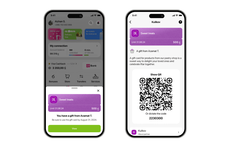
Receiving a Gift Card
The flow accounts for both existing app users and recipients who do not yet have the app installed.
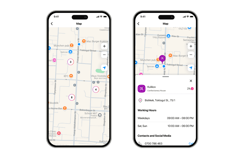
Redeeming at Partners' Locations
Implemented map with location pins gives an easy way to find a partner place.
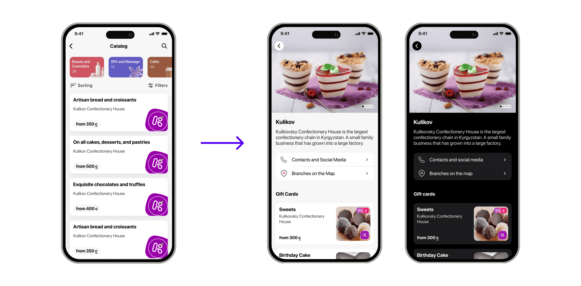
partners feedback after MVP launch
After launching the MVP, we received feedback from partners that newly added gift cards were displayed sequentially, which led to uneven visibility: some partners consistently appeared at the top, while others were pushed down.
Instead of implementing complex rotation logic (that wasn't possible with our technical resources), I restructured the catalog by organizing multiple gift cards from the same partner into a single “About Partner” screen. This improved fairness, reduced visual clutter, and made the marketplace more scalable as the number of partners grows.
Results
Within 4 months post-launch:
63 partner brands were onboarded
2,113 gift cards were sold
285 new users joined the platform
These indicators validated initial demand and confirmed that digital gifting resonated within the ecosystem. Next iterations are coming soon for further product scaling